Sunday, September 11, 2011

Saul Bass project: Concept

For my Design Principles, I was given information and images to create a flyer for MoMA, the Museum of Modern Art in New York. It featured a modern artist named Saul Bass, a graphic artist famous for his film posters and title sequences for films, including Vertigo, Psycho, and Anatomy of a Murder. He also designed logos for United Airlines, Girl Scouts, and AT&T.


Very inspirational! I remember as a kid being interested in the design of the AT&T logo and the Girl Scout logo especially. I guess it occurred to me that someone had designed those logos, but I never thought that they'd be famous and have art featured at museums.

But, here is my concept based on images from Anatomy of a Murder (provided for us), as a practice in layout and grid design.


Saturday, September 10, 2011

Exercise: Michael Schwab poster


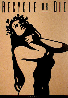
This exercise was to replicate a poster by Michael Schwab, whose art you definitely know. The piece I remember the most by him is one of Alcatraz--I remember going to San Fransisco when I was nine and seeing that art (on a pin or something) and really liking it.

He's also done logos for NPR, Amtrak, and David Sedaris!


Anyway, this is the original poster and my replication (the original is way better, of course, I only spent an hour on the copy.


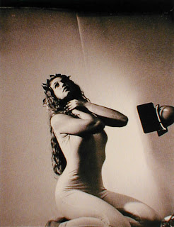
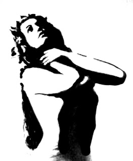
In this exercise we were given a reference photograph that Schwab took of a model before making his poster. Then we adjusted the levels in Photoshop to emphasize the lights and shadows and then used a brush to make a virtually all black and white silhouetted. This was to make is really easy to use live trace in Illustrator to covert the image to a vector.

Then I fiddled with the vector and made the image look (somewhat) like the original poster. I didn't really want to spend too much time on it--editing images as a vector is hard. If I were doing a project like this again I'd probably do it differently, sketch more of it out in Photoshop before tracing it in Illustrator.


Friday, September 9, 2011

Example of emphasis

As an exercise, I found an image that utilized emphasis in its design.


This illustration is by Denise Hilton Campbell, and it uses emphasis the jar of fireflies in several ways. First of all, the color of the light is very different than the dark tones in the rest of the image, so our eye is drawn to the lights. The color is used on the free fireflies and is reflected on the children's faces, which ties the whole image together by increasing unity, but it is concentrated in the jar to make it obvious. Pretty obvious, but the children are also looking at the jar so it increases the jar's importance as the focal point.

Thursday, September 8, 2011

Illustration styles: Paul Hoppe


The illustration I found today that I liked was from the Society of Illustrators 51st Annual (2009), by Paul Hoppe. Whenever I travel, I am really drawn to the intricate textures I find in architecture and cityscapes, and this picture reminded me of it. This image also has a similar style to the piece I found last week by Josh Cochran--subtle shading, with an emphasis on line, and an overall calm tone.

Here is another illustration by Paul of the same cityscape style, that I like a lot. Little bit of playful humor in it, too.


While looking on his website, I also came across two illustrations that were featured on the cover of The Stranger! The Stranger is a free weekly newspaper made and printed in Seattle--well known for it's tongue-in-cheek humor and willingness to push the envelope on sometimes uncomfortable topics like race, gender, drugs, etc. (I felt like mostly The Stranger wanted to tell it's readers to just "get over yourself.") Anyway, I came to love The Stranger and especially it's very interesting covers, which I would cut out and line my walls with in college as a cheap way to make my apartments look interesting. So, it's always exciting to find illustrators that have been featured on The Stranger.

Here is one illustration by Paul that I had on my wall at some point:


Wednesday, September 7, 2011

Sketch: James


My sketch this week is of my boyfriend, James. We went on a date to see Another Earth at the Art Theater and had some free time before the movie, so we went to the park in downtown Champaign. This is the first drawing I've ever made of him (and he said he was nervous).

By the way, Another Earth is one of those good scifi's where there's a concentration on interesting plot and characters rather than special effects. I recommend it.

Tuesday, September 6, 2011

Product illustration: Concept

See brief and inspiration. I looked on the Timbuk2 website for inspiration on ideas or themes to include in the ad and found that the company has a lot of pride of being from San Fransisco, still having a factory there, and giving back to their local community. So, I took some of those themes and decided the composition would be a person standing in front of and facing the Golden Gate bridge while wearing a Timbuk2 bag. The tagline is "Born, bred, and here to stay" and "After 20 years, our custom bags are still manufactured in the heart of San Fransisco" (this is modified text from the Timbuk2 About Us website page).

Because I can decide these sorts of things (haha), the ad would appear in San Fransisco Magazine.


References: Personal photographs from a family vacation to San Fransisco.

 
 Personal reference photo for person.

Created on the Timbuk2 website for designing a custom bag.


Monday, September 5, 2011

Silhouette illustration: Concept

This is the concept sketch for the silhouette illustration (see brief and inspiration). A major event in this comical play is when a plane crashes, so an old fashioned biplane is shape of the major silhouette with the play's name Misalliance coming out of the plane as smoke. I think additional copy will appear at the bottom of the flyer, since it's complicated to do all do by hand. The silhouette of the plane will be made up of Victorian style household items and men and women's accessories (marriage is another theme of the play).


The silhouette of the plane will be made up of Victorian style household items and men and women's accessories. Sketches of these are shown below. I will outline these in Illustrator and then arrange them in the program (much easier that way).


My reference image of the biplane silhouette, from iStock, is shown below. The reference for the Victorian items were mostly from an episode of Sherlock Holmes with Jeremy Brett--I watched it for inspiration and drew the images by sight, so there are no references images for those.

Sunday, September 4, 2011

Saul Bass project: Brief

Client: MoMA, Museum of Modern Art (New York City, NY)

Project: Saul Bass or Grid

Specifications: Design a museum screening handout about influential designer Saul Bass.

Reproduction: The handout will be printed in black and white on one 8.5 x 11 inch paper. The font will be Franklin Gothic (two font sizes and two weights). It must include the client-provided text and images (at least three).

Justification: The purpose of this is to learn to utilize the grid as a design concept and practice using Illustrator.


Random things I find

Did you ever, as a kid, go to Pizza Hut and scribble on those paper placemats they had with puzzles with everything to do with pizza? Like this:


Well, that illustration was done by Marcos Sorensen. He also happened to design the Ask Jeeves logo. Who knew?!!


Saturday, September 3, 2011

Exercise: Coffee logo

This was an exercise in which we designed a logo for a coffee company. First we found a stock image we liked and traced it using tissue paper. The drawing was scanned into Illustrator and traced to make a black and white logo. Then we made a version with color.

I liked the shapes of the coffee cup in the image, so I tried to emphasize that in my design and use the negative space.


Friday, September 2, 2011

Exercise in unity

This was an exercise in unity and using different methods such as proximity, repetition, and continuation. Done within a pre-made Illustrator file, first we had to 'sketch' out several ideas and then pick our best examples and put them here. Which is your favorite?


Gridline exercise

A very simple assignment: take a picture off the internet and set some gridlines on it in Illustrator. Find the "natural" grid in a real-life image. Gridlines are used for placing copy (text) and margins, creating the layout in a design piece.

I've been missing Seattle lately, and it's abundant inspirations of nature and culture. (On Tuesday a couple people had SIFF posters as research inspiration and the teacher said, "Wouldn't it be great if we all lived in Seattle? So much inspiration everywhere." You have no idea.)

Anyway, I think a title and subtitle could go in the upper left and some copy could go in the lower right (if the lights were blacked out more).


Thursday, September 1, 2011

Illustration style: Josh Cochran

The illustration below is by Josh Cochran, from the Society of Illustrators 51st Annual of American Illustration (2009).


What I like about the style is that it seems to be subtle and realistic--just a monk walking through the rain. This is exemplified by the limited palette and shading scheme; the familiar ochre-orange outfit and unusual but complimentary skin tone makes the figure the first thing we notice. But on second look we see the reflection and a surreal aspect suddenly enters the picture when we find a hidden city.

He's also done silkscreen (t-shirt) designs for Death Cab for Cutie, which you can see on his website. Here's another image by him, which I like a lot; the wobbly lines, sketchiness, color-outside-the-lines style adds to the spontaneous nature of the busy city scene:


Wednesday, August 31, 2011

Sketchbook scan

This week's sketchbook scan is primarily a study of a guitar, particularly the lighting on the side of it. I've been interested in lighting on various surfaces lately, because I haven't paid much attention to it in the past. At least not on obscure things like the sides of guitars. I did a gradient bar--perhaps useful for an Illustrator illustration one day.

Also, more cats. And cat ears. I'm adopting a kitty soon, so I'm a little obsessed.


Tuesday, August 30, 2011

Product illustration: Inspiration

I wasn't thrilled to do the product illustration, mostly because I have kind of a beef with using my skills to promote something like pointless consumerism and/or self-image problems (clothing/beauty ads). But, once I decided to do a TimBuk2 messenger bag, a quality product I love and made by a not-so-evil company, I warmed up to the idea. (Needless to say, I'm very socially aware.)

While researching advertisements for inspiration on my own product illustration, I came across these examples. The first is by Joe Saputo, and is a style I really like. Showing the design lines and/or insides of the product is really cool for a high tech product. In this case, the style emphasizes design and therefore high quality and engineering to the buyer, so the illustration is very effective for those types of products.


But, I don't plan on doing a high-tech product, so I looked for other styles. This next ad features a photograph of a product with some illustrated designs and copy, by Nate Williams. I think it's effective because it still allows the product to be the focus while containing interesting elements from illustration.


 This next one, although for a beer advertisement, has a similar style that has a product photo within an illustration. Seems like more fun to draw. By Bunky Hurter. This style also lets the illustrator skip out on drawing the product! Might seem like cheating but it also side-steps the issue of the illustrator portraying or stylizing the product in a way that the client or viewer does not find appealing. Very important.


This last one I just thought was so wonky and crazy, I had to include it. By Andy Lackow.

Product illustration: Brief

Client: Timbuk2 (San Fransisco, CA)

Project: Product Illustration

Specifications: Choose a product that you own or would like to own, but make sure it is small enough to be photographed on a table top. The required elements for the finished magazine ad are: an original illustration created by you, a simple headline, and your client's logo. Your final design must show an understanding of unity, emphasis and balance. When appropriate, utilize rhythm and depth as well.

Reproduction: The illustration will be printed as a magazine beauty shot (full-page ad).

Justification: I first encountered Timbuk2 bags in Seattle, where they are very popular and somewhat of a fad. However, after borrowing someone's while going out to the field, I fell in love with its great design, quality materials, and practicality. The classic messenger bag is fully waterproof (good for Seattle, of course), extremely durable, easy to adjust and open without taking it off, and includes features such as reflective clips and second side strap which are excellent for safe and easy biking. Soon I had my own gold-black-gold bag, which I've used daily for several years.

Monday, August 29, 2011

Silhouette illustration: Inspiration

In researching different silhouette styles, I came across the work of Sarah Coleman. I really like the intricate pieces of the little drawings that form a larger picture. So, I think I will emulate this style in my piece.


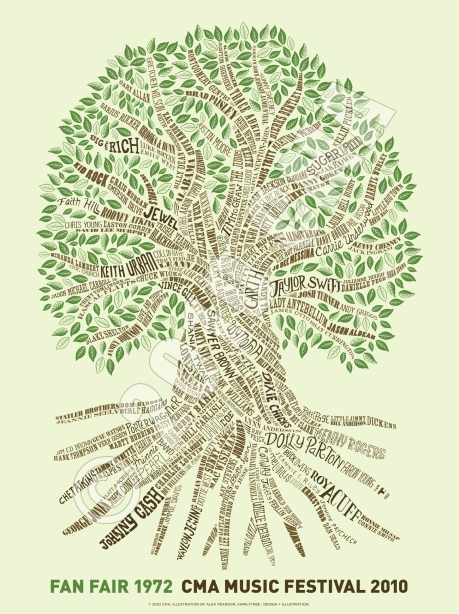
Here are some more examples of festival posters that use the silhouette style I am interested in. I like this style because from far away, you can see a shape or word, but you can also tell that there is something more going on in the illustration. Thus, the style forces you to lean closer and examine the image in more detail; it makes you examine the flyer for an extended period of time. This makes the poster effective in capturing the viewers attention.

CMA Music Festival 2010, by Alex Pearson


Cornwall Film Festival 2009 poster, by Matt Hocking and Darren Whittington

Silhouette illustration: Brief

Client: Krannert Center for the Performing Arts (Champaign, IL)

Project: Silhouette Illustration

Specifications: Create an illustrated event poster for a festival. The client can be a producer of any kind of festival (music, art, theater, dance, film, food, etc.). The art must be 100% vector and be created in the style of silhouetted illustrations.

Reproduction: The art will be printed in black and one PMS color at a size of 11x17 inches.

Justification: I love plays--my parents took me to several as a kid and I also worked in the scene shop all through college. I looked at the Krannert website for an upcoming play that I was familiar with, but there were none, so I decided instead to do a flyer for a play I had already seen. I picked Misalliance, by George Bernard Shaw, which I saw last year.

Although it was written around 100 years ago (1910), the comical play has some very advanced ideas concerning marriage and women's independence. The important characters of the play are a young, restless woman who's engaged and an independent Polish acrobat who arrives unexpectedly in a plane crash. I decided my concepts will probably center around the plane and juxtaposition of these two women.

Wednesday, August 24, 2011

First sketches

These are two sketches I made this week, focusing on cat heads. I observed two different types of head shapes, one with an elongated face with a jaw that sticks out and the other more round and compact, in some cats I saw in real life. The sketches themselves are from photographs I took myself at different points in time. (I termed the different face types "french cat" and "british cat" for no apparent reason--perhaps the cats faces remind me of English and French styles or fashions. "Turkish cat" is from a photo of my friend's cat in Turkey).

Since I was concentrating on shape, I started to notice a "hidden geometry" in the faces of the cats, particularly circles in the checks. So, then I tried a sketch that explored the shapes I could find in the cat's face--that's the second sketch.