I liked the following designed because they impliment what I think an excellent website should be: clean, simple, and attractive. I also chose websites that featured illustrations, which is something I'd like to include in my website design.
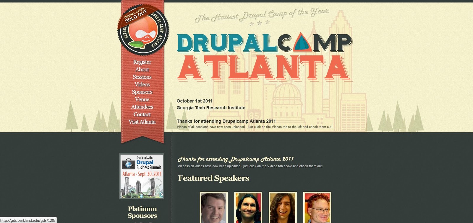
This one is my favorite--a website for DrupalCamp Atlanta, a conference for people associated with Drupal, a content management system (think website design). I like the subtle details of the 'stitched' style and bookmark navigation bar, the illustrated typeface, and how the front page features a larger illustration that has a treeline motif repeated on the inside pages.

The next example is for a software called Iceberg and has an even more simplified page with a single illustration for emphasis.


The final design is a personal website for an artist Adit Shukla. I think the red color is pretty extreme and could be less saturated for a warm, inviting feeling without as much shock value. But, the header illustration and how it leads into the navigation bar is very creative.

