Showing posts with label exercise. Show all posts

Wednesday, January 25, 2012

I made a spaceship!

A 3D image, actually. (If only it were real!)
This is one of the first thing's I've made in my 3D animation class that was actually cooler than a photo frame or a window.

It only took about 45 minutes--although our teacher walked us through the whole thing. The first image is what I actually made, by 'extruding' (expanding the sides of) a simple cube, part by part. Then Maya (the 3D software program) makes it soft and aerodynamic with the click of a button.

It's pretty cool! I'm excited to do more.


Friday, November 25, 2011

Wynona Ryder practice book cover


This was a practice book cover. Some things I learned were separating the face to get different details when applying levels (on the photograph, before it's autotraced) and using Illustrator stamp tool to make the paint splatters. We used Photoshop, Illustrator, and InDesign to make this art, so it was pretty comprehensive.

Friday, November 18, 2011

Color logos


This exercise was for learning about PMS colors and applying emotional color styles to logos.

Friday, November 11, 2011

Color music and dominance

Similar to what we did with rhythm, we listened to different types of music and made color schemes that we thought represent that music.

This one was called color "dominance" but it has more to do with emotion associations with colors.


Saturday, November 5, 2011

Zen clouds exercise

This exercise was our last formal one for class and concentrated on teamwork. The assignment was to create (within the limits of the class period) five illustrations for the story below. The title page, first, and last illustrations were supposed to remain as they were (with "Clouds" or blank). Our group of five people ended up splitting up the illustrations for one per person but agreed on a style--solid color (from the Art History: Medieval standard palette) with a simple, single object to represent the words.

Our teacher was really impressed, and said it looked like it was made by a single artist (he used the word "perfect"). I really liked the assignment because I think we were really successful in working together, and it was a lot of fun! Go team!

You can click on the images for larger versions.


Friday, November 4, 2011

Color depth and color seasons

Here are a couple more exercises with color that we did. Color depth deals with using color to make the illusion of space or objects taking up space. Bright colors typically advance and dark or dull colors typically recede.


Seasonal colors played with palettes. What colors make us think of the seasons? If you were designing a card for Mother's Day, which colors would seem appropriate?


Saturday, October 29, 2011

Web button exercise

Today we made this web button as a large version and then shrunk it down for the web.


Friday, October 28, 2011

Color contrast and balance

Here's something I've been kind of dreading... color exercises! It's turned out to not be so bad, I guess because everything looks good to me. It may not be a problem until I get grades back. What am I talking about? I'm red-green colorblind.

This exercise was on color contrast. The words of "contrast" were white and we had to change it to a color that contrasted well with the background color. I mostly used complementary hues with the opposite with the opposite brightness or saturation.


This other exercise was to incorporate balance into the design. The left large box was a color and we had to balance it by changing the smaller boxes on the right side. First I tried monochromatic schemes, and then I also tried to just change the hue while keeping the same saturation and brightness. However, sometimes that doesn't work... this one took a lot of fiddling around. I will probably look at this tomorrow and want to change something!


Saturday, October 22, 2011

Isometric drawing exercise

This exercise was to make an isometric drawing, which is a fake perspective. (It's fake because there is no vanishing points, and all edges are parallel.) It's pretty simple yet effective.


Friday, October 21, 2011

Map exercise

This exercise was in preparation for a project. We replicated this simplified map of the Champaign-Urbana area that highlighted fun things to do on a Friday night. This was all done in Illustrator.


Some things I learned in this exercise would be how to make the double line (make a line with a thick stroke and then outline the stroke) and also using a font called Carta that has the dingbats (little images) for the highway symbols. I didn't really like this exercise because it took a long time (with all the text and icons) and felt like busy work...

Saturday, October 8, 2011

Custom blend exercise


This little illustration was, I think, the most interesting exercise I've done for my classes to date. This method is often used in technical drawings. The technique for this was using custom blends, by putting several different shapes of various shades next to each other and literally clicking a button that blends them together. It's deceptively easy, and produces a great result.

The cord was made by layering strokes of various shades and widths and blending them. For example, replicating the cord path three times and changing the bottom to a 9-point dark stroke, then a 6-point medium stroke, and 2-point light stroke on top of it.

The shapes were traced by hand over a photograph and the colors were eye-droppered from the same photo. I can't wait till I have time to use this technique again!

Friday, October 7, 2011

Exercise in depth

I liked this exercise, particularly because utilizing depth is a good excuse to play with texture, which I like a lot. I was a bit creative in the content for this exercise. Did you notice? It spells my name.


Friday, September 30, 2011

Visual Rhythm


This week's exercise was interesting because we got to listen to music and then translate that into visual rhythm. Surprisingly, I think bluegrass is my favorite visually.

Saturday, September 24, 2011

Building poster exercise

Our exercise this week was to replicate this lovely Champaign building poster in Photoshop and Illustrator and then separate the layers by color to get it ready for silk screen printing. This is the finalized poster we were replicating and the reference photo we were given from which to start our illustrations.
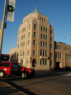


I learned how to do some really useful things, like straigtening the photo and using distort to increase the perspective on the building, to make it look taller (and more impressive?) than it actually is in the photo. We also created vanishing points and reference lines to help use line up our shapes. Here's a preview of what the reference photo looked like when we were done:


Then we put the image in Illustrator and started tracing! I learned some handy tricks I wouldn't have thought of if I was trying it on my own. For instance, instead of tracing each window individually, we made a long, vertical rectangle over each column of windows, then made horizontal rectangles the same color of the building to fill in the negative space. Here's an in-progress shot:


Next (this week, everything else was done last week) we practiced separating the objects and layers appropriately so the image would print correctly in a silkscreen process. For example, in the original Illustrator file, the sky is just a blue rectangle behind the building. But in a silkscreen process, it needs to have the negative of the building taken out, because otherwise it would look weird having the tan on top of the blue (it would probably look weird). However, black can go on top of anything--in fact, you get a "rich" or deeper black color if it is printed on top of other colors, as opposed to the white paper.

I also learned some neat short-cuts for dealing with text, such as Ctrl + Shift + > or < for increasing or decreasing text size and Alt + left arrow or right arrow for creating spaces between the letters (as with "Illinois" on the poster) which is called tracking. These are the final layers, ready for printing! We will be printing our original illustrations for a travel poster using this method, too!


Friday, September 23, 2011

Friday, September 16, 2011

Exercise in emphasis

Another exercise in Illustrator, this time with emphasis! I thought this one was way more fun than the unity exercise I did earlier. Also, emphasis by placement is way hard to do without isolation or direction.

We tested some ideas and then picked our favorite six to turn in.


Saturday, September 10, 2011

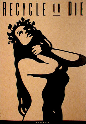
Exercise: Michael Schwab poster


This exercise was to replicate a poster by Michael Schwab, whose art you definitely know. The piece I remember the most by him is one of Alcatraz--I remember going to San Fransisco when I was nine and seeing that art (on a pin or something) and really liking it.

He's also done logos for NPR, Amtrak, and David Sedaris!


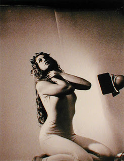
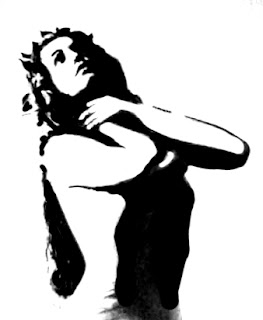
Anyway, this is the original poster and my replication (the original is way better, of course, I only spent an hour on the copy.


In this exercise we were given a reference photograph that Schwab took of a model before making his poster. Then we adjusted the levels in Photoshop to emphasize the lights and shadows and then used a brush to make a virtually all black and white silhouetted. This was to make is really easy to use live trace in Illustrator to covert the image to a vector.

Then I fiddled with the vector and made the image look (somewhat) like the original poster. I didn't really want to spend too much time on it--editing images as a vector is hard. If I were doing a project like this again I'd probably do it differently, sketch more of it out in Photoshop before tracing it in Illustrator.


Friday, September 9, 2011

Example of emphasis

As an exercise, I found an image that utilized emphasis in its design.


This illustration is by Denise Hilton Campbell, and it uses emphasis the jar of fireflies in several ways. First of all, the color of the light is very different than the dark tones in the rest of the image, so our eye is drawn to the lights. The color is used on the free fireflies and is reflected on the children's faces, which ties the whole image together by increasing unity, but it is concentrated in the jar to make it obvious. Pretty obvious, but the children are also looking at the jar so it increases the jar's importance as the focal point.

Saturday, September 3, 2011

Exercise: Coffee logo

This was an exercise in which we designed a logo for a coffee company. First we found a stock image we liked and traced it using tissue paper. The drawing was scanned into Illustrator and traced to make a black and white logo. Then we made a version with color.

I liked the shapes of the coffee cup in the image, so I tried to emphasize that in my design and use the negative space.