Client: Yearling Publishing (Random House)
Project: Illustrated novel
Specifications: Create five illustrations for a novel that is for high school students. The sample illustrations include (1) the title page, (2) a full page illustration, (3) a half page, (4) a quarter page, and (5) an initial capital for a chapter opening.
Reproduction: The proposed page size is 10 inches square. All illustrations will be in black except for one in black with one spot color and another in full color.
Justification: I'm choosing to do A Wrinkle in Time by Madeleine L'Engle. This was one of my favorite books when I was a young adult, and it's really fun to do because it's science fiction/fantasy and has interesting aliens and characters.
Showing posts with label brief. Show all posts
Showing posts with label brief. Show all posts
Tuesday, November 22, 2011
Monday, November 21, 2011
Biography book cover brief
Client: Penguin Publishing
Project: Biography book cover illustration
Specifications: The design will be for the front and spine of a biography of a person of the designer's choosing. The over must have the title of the book (who the biography is about), the designer's name, and an original illustration. The illustration must convey the subject's personality through the use of color, composition, lighting, line, or distortion.
Reproduction: The cover will be printed in full color. There are no requirements on the size of the book.
Justification: I'm going to do a cover for my friend, Jaime Hough. She joked that one day she will have a biography/memoir, so I thought she would be a good choice. She also has a big personality, so it will be easy to portray in an illustration using color.

Tuesday, November 1, 2011
Wine label illustration brief
Client: Softpaws Winery (fictional)
Project: Wine label illustration
Specifications: Create an illustrated wine bottle label and attach it to an existing wine bottle. The illustration must feature hand-generated type for all major typographic elements (fine print can be typeset). It must also feature the name of the vineyard/winery, type of wine, year of vintage, and fine print.
Reproduction: Create an illustrated wine bottle label and attach it to an existing wine bottle. To use in a portfolio, photograph the bottle with the label or digitally apply the label to a photograph of a bottle.
Justification: I made up a winery because the existing ones I liked had really cool illustrations already. I chose "Softpaws" because I was inspired by the movie Puss in Boots and I like fun wine labels with interesting animals. Plus, it's been shows that wines with animals on the label sell more!
Monday, October 31, 2011
Architecture illustration brief
Client: The Preservation and Conservation Association of Champaign County (PACA)
Project: Architecture illustration
Specifications: Create an illustrated poster of a landmark building in Champaign-Urbana.
Reproduction: The poster is 11x17 inches and will printed with a 4-color process. The finished poster must have an original illustration, the name of the building, a short paragraph describing the style of the building, a typographic PACA logo, and PACA's web address.
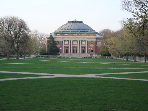
Justification: One of the choices of buildings we were given was Foellinger Auditorium on the University of Illinois campus. I have admired that building before because it is colonial and I think it looks great at the end of the quad. Here is a sample picture from the U of I website if you're not familiar with the building:

Project: Architecture illustration
Specifications: Create an illustrated poster of a landmark building in Champaign-Urbana.
Reproduction: The poster is 11x17 inches and will printed with a 4-color process. The finished poster must have an original illustration, the name of the building, a short paragraph describing the style of the building, a typographic PACA logo, and PACA's web address.
Justification: One of the choices of buildings we were given was Foellinger Auditorium on the University of Illinois campus. I have admired that building before because it is colonial and I think it looks great at the end of the quad. Here is a sample picture from the U of I website if you're not familiar with the building:
Tuesday, October 11, 2011
Newspaper editorial spot: Brief
Client: The News Gazette (Central Illinois)
Project: Newspaper editorial spot illustration
Specifications: Create a spot illustration to accompany feature article for The News-Gazette.
Reproduction: The art will be printed in black and white, two column inches wide.
Justification: In college I liked to read The Science Times, a special part of The New York Times that came out every Tuesday. The short articles about new scientific findings frequently had spot illustrations with them. I plan to find a scientific article and design an illustration for it.
Project: Newspaper editorial spot illustration
Specifications: Create a spot illustration to accompany feature article for The News-Gazette.
Reproduction: The art will be printed in black and white, two column inches wide.
Justification: In college I liked to read The Science Times, a special part of The New York Times that came out every Tuesday. The short articles about new scientific findings frequently had spot illustrations with them. I plan to find a scientific article and design an illustration for it.
Monday, October 10, 2011
Holiday card: Brief
Client: Parkland College (Champaign, IL)
Project: Holiday card illustration
Specifications: Create an illustration for the Parkland holiday card. The illustration shouldn't indicate any particular religious traditions as to be inclusive of the entire Parkland community. The card should reflect Parkland's culture, campus, and philosophy.
Reproduction: The art will be printed in CMYK on a card that fits inside a standard envelope and printable by Parkland's in-house printer. The envelope must include the Parkland logo and return address. The card must include the artist's name somewhere.
Justification: I like whimsical holiday illustrations, especially with animals. Parkland's mascot is the cobra, so I would like to do an illustration with the cobra in a winter-themed composition. Winter break from school is usually a relaxing, fun time and I'd like to relate that in my art in a humorous or light-hearted way.
Project: Holiday card illustration
Specifications: Create an illustration for the Parkland holiday card. The illustration shouldn't indicate any particular religious traditions as to be inclusive of the entire Parkland community. The card should reflect Parkland's culture, campus, and philosophy.
Reproduction: The art will be printed in CMYK on a card that fits inside a standard envelope and printable by Parkland's in-house printer. The envelope must include the Parkland logo and return address. The card must include the artist's name somewhere.
Justification: I like whimsical holiday illustrations, especially with animals. Parkland's mascot is the cobra, so I would like to do an illustration with the cobra in a winter-themed composition. Winter break from school is usually a relaxing, fun time and I'd like to relate that in my art in a humorous or light-hearted way.
Tuesday, September 20, 2011
Step-by-step instruction: Brief
Client: BadOrigami.com
Project: Step-by-step instruction illustration
Specifications: Create a series of illustrations for as instruction sheet that show how to perform a simple action. Take photographs of the steps to use for reference material. Three to six steps must be shown in three-inch panels with explanatory copy.
Reproduction: The illustrations will be reproduced on a letter-sized piece of paper in CMYK.
Justification: I have enjoyed folding origami since I was eight years old. Periodically, I seek out challenging and complex instructions for new pieces. As with anyone who has ever tried origami, I sometimes come across instructions that are far too complex or confusing. I decided to do this illustration for BadOrigami.com, a site that has it's own (very good!) instructions for folding, and also recipes for their favorite cocktails and party snacks. Instead of doing a serious piece on origami instructions, I decided to do a satirically bad instructional as an advertisement for them.
Project: Step-by-step instruction illustration
Specifications: Create a series of illustrations for as instruction sheet that show how to perform a simple action. Take photographs of the steps to use for reference material. Three to six steps must be shown in three-inch panels with explanatory copy.
Reproduction: The illustrations will be reproduced on a letter-sized piece of paper in CMYK.
Justification: I have enjoyed folding origami since I was eight years old. Periodically, I seek out challenging and complex instructions for new pieces. As with anyone who has ever tried origami, I sometimes come across instructions that are far too complex or confusing. I decided to do this illustration for BadOrigami.com, a site that has it's own (very good!) instructions for folding, and also recipes for their favorite cocktails and party snacks. Instead of doing a serious piece on origami instructions, I decided to do a satirically bad instructional as an advertisement for them.
Monday, September 19, 2011
Silkscreen travel poster: Brief
Client: Amtrak
Project: Silkscreen Travel Poster
Specifications: Create an illustrated travel poster to be hung at various Amtrak stations. The client wants the art to be in the classic travel poster style that was prevalent in the 1930's and 1940's during the WPA era, a style still popularized by artists like Michael Schwab.
Reproduction: The poster will be printed using the silkscreen process at a size of 12 x 15 inches at Weiskamp Screen Printing (Champaign, IL). The poster must have the name of the destination, Amtrak logo, and use a maximum of three PMS colors.
Justification: I looked at several routes on the Amtrak website and the name of the "Coast Starlight" appealed to me visually--I imagined a train traveling along the ocean with the stars above. The route extends between Seattle and Los Angeles, stopping at cities like Portland, Sacramento, and Oakland; the illustration will probably feature famous scenery from one of those places. I particularly liked this description: "The dramatic snow-covered peaks of the Cascades Range and Mount Shasta, lush forests, fertile valleys and long stretches of Pacific Ocean shoreline provide a stunning backdrop for your journey."
Project: Silkscreen Travel Poster
Specifications: Create an illustrated travel poster to be hung at various Amtrak stations. The client wants the art to be in the classic travel poster style that was prevalent in the 1930's and 1940's during the WPA era, a style still popularized by artists like Michael Schwab.
Reproduction: The poster will be printed using the silkscreen process at a size of 12 x 15 inches at Weiskamp Screen Printing (Champaign, IL). The poster must have the name of the destination, Amtrak logo, and use a maximum of three PMS colors.
Justification: I looked at several routes on the Amtrak website and the name of the "Coast Starlight" appealed to me visually--I imagined a train traveling along the ocean with the stars above. The route extends between Seattle and Los Angeles, stopping at cities like Portland, Sacramento, and Oakland; the illustration will probably feature famous scenery from one of those places. I particularly liked this description: "The dramatic snow-covered peaks of the Cascades Range and Mount Shasta, lush forests, fertile valleys and long stretches of Pacific Ocean shoreline provide a stunning backdrop for your journey."
Sunday, September 4, 2011
Saul Bass project: Brief
Project: Saul Bass or Grid
Specifications: Design a museum screening handout about influential designer Saul Bass.
Reproduction: The handout will be printed in black and white on one 8.5 x 11 inch paper. The font will be Franklin Gothic (two font sizes and two weights). It must include the client-provided text and images (at least three).
Justification: The purpose of this is to learn to utilize the grid as a design concept and practice using Illustrator.
Tuesday, August 30, 2011
Product illustration: Brief
Client: Timbuk2 (San Fransisco, CA)
Project: Product Illustration
Specifications: Choose a product that you own or would like to own, but make sure it is small enough to be photographed on a table top. The required elements for the finished magazine ad are: an original illustration created by you, a simple headline, and your client's logo. Your final design must show an understanding of unity, emphasis and balance. When appropriate, utilize rhythm and depth as well.
Reproduction: The illustration will be printed as a magazine beauty shot (full-page ad).
Justification: I first encountered Timbuk2 bags in Seattle, where they are very popular and somewhat of a fad. However, after borrowing someone's while going out to the field, I fell in love with its great design, quality materials, and practicality. The classic messenger bag is fully waterproof (good for Seattle, of course), extremely durable, easy to adjust and open without taking it off, and includes features such as reflective clips and second side strap which are excellent for safe and easy biking. Soon I had my own gold-black-gold bag, which I've used daily for several years.
Project: Product Illustration
Specifications: Choose a product that you own or would like to own, but make sure it is small enough to be photographed on a table top. The required elements for the finished magazine ad are: an original illustration created by you, a simple headline, and your client's logo. Your final design must show an understanding of unity, emphasis and balance. When appropriate, utilize rhythm and depth as well.
Reproduction: The illustration will be printed as a magazine beauty shot (full-page ad).
Justification: I first encountered Timbuk2 bags in Seattle, where they are very popular and somewhat of a fad. However, after borrowing someone's while going out to the field, I fell in love with its great design, quality materials, and practicality. The classic messenger bag is fully waterproof (good for Seattle, of course), extremely durable, easy to adjust and open without taking it off, and includes features such as reflective clips and second side strap which are excellent for safe and easy biking. Soon I had my own gold-black-gold bag, which I've used daily for several years.
Monday, August 29, 2011
Silhouette illustration: Brief
Client: Krannert Center for the Performing Arts (Champaign, IL)
Project: Silhouette Illustration
Specifications: Create an illustrated event poster for a festival. The client can be a producer of any kind of festival (music, art, theater, dance, film, food, etc.). The art must be 100% vector and be created in the style of silhouetted illustrations.
Reproduction: The art will be printed in black and one PMS color at a size of 11x17 inches.
Justification: I love plays--my parents took me to several as a kid and I also worked in the scene shop all through college. I looked at the Krannert website for an upcoming play that I was familiar with, but there were none, so I decided instead to do a flyer for a play I had already seen. I picked Misalliance, by George Bernard Shaw, which I saw last year.
Although it was written around 100 years ago (1910), the comical play has some very advanced ideas concerning marriage and women's independence. The important characters of the play are a young, restless woman who's engaged and an independent Polish acrobat who arrives unexpectedly in a plane crash. I decided my concepts will probably center around the plane and juxtaposition of these two women.
Project: Silhouette Illustration
Specifications: Create an illustrated event poster for a festival. The client can be a producer of any kind of festival (music, art, theater, dance, film, food, etc.). The art must be 100% vector and be created in the style of silhouetted illustrations.
Reproduction: The art will be printed in black and one PMS color at a size of 11x17 inches.
Justification: I love plays--my parents took me to several as a kid and I also worked in the scene shop all through college. I looked at the Krannert website for an upcoming play that I was familiar with, but there were none, so I decided instead to do a flyer for a play I had already seen. I picked Misalliance, by George Bernard Shaw, which I saw last year.
Although it was written around 100 years ago (1910), the comical play has some very advanced ideas concerning marriage and women's independence. The important characters of the play are a young, restless woman who's engaged and an independent Polish acrobat who arrives unexpectedly in a plane crash. I decided my concepts will probably center around the plane and juxtaposition of these two women.
Subscribe to:
Posts (Atom)