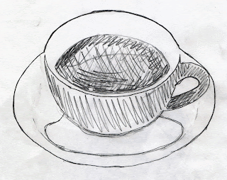
I liked the shapes of the coffee cup in the image, so I tried to emphasize that in my design and use the negative space.
Check out my Blog for recent updates on what I've working on or art that inspires me, see the progression of selected works on my Process Page, or browse my Portfolio for finalized pieces.
Saturday, September 3, 2011
Exercise: Coffee logo
This was an exercise in which we designed a logo for a coffee company. First we found a stock image we liked and traced it using tissue paper. The drawing was scanned into Illustrator and traced to make a black and white logo. Then we made a version with color.
I liked the shapes of the coffee cup in the image, so I tried to emphasize that in my design and use the negative space.
I liked the shapes of the coffee cup in the image, so I tried to emphasize that in my design and use the negative space.
Subscribe to:
Post Comments (Atom)


No comments:
Post a Comment