This is the final for my Foellinger Auditorium poster. The color was done with a Photoshop preset watercolor brush. I also fiddled with the copy and the positioning of the sidewalk X. I think this one turned out really well! It's probably my favorite that I've done so far.
This image prints at 11x17, so it's very large. Click on the image for a larger preview.
Check out my Blog for recent updates on what I've working on or art that inspires me, see the progression of selected works on my Process Page, or browse my Portfolio for finalized pieces.
Showing posts with label architecture. Show all posts
Monday, November 21, 2011
Monday, November 14, 2011
Foellinger Auditorium poster proof
This is the proof for a 11x17 inch poster of Foellinger Auditorium. I tried to do a scratchboard style by putting a black fill layer over my reference image and then painting on a mask layer.
I still need to adjust the symmetry of the image with the text and add color (like a watercolor style). I will also add some more details, finish the fence on the right side, etc.
Monday, November 7, 2011
Architecture illustration concepts
Here are two concepts for the poster of Foellinger Auditorium. The building is very symmetrical (neo-classical style, I think), so I wanted to emphasis this elegance in the poster. The first concept shows only one half of the building and allows for greater attention to the details, and has good assymetrical balance overall--which I think is typically more interesting as far as compositions go. The second concept I also like because it shows the quad (large, open lawn with diagonal sidewalks) where the building is located. This gives it a very regal appearance, akin to the White House. But, there would be less details--something that might be hard considering I want to do this in a woodcut or scratchboard style.
Monday, October 31, 2011
Architecture illustration inspiration
For this project, I'd like to try an engraved or scratchboard technique (perhaps figure out how to do it digitally). Here are some inspirational figures of this sort of technique done in architecture.
This is a detail of a piece in color by Steven Noble.
This one another detail, by Keith Witmer.
This is extremely detailed--I probably won't go this far. By Kevin Sprouls .
This is a detail of a piece in color by Steven Noble.
This one another detail, by Keith Witmer.
This is extremely detailed--I probably won't go this far. By Kevin Sprouls .
Architecture illustration brief
Client: The Preservation and Conservation Association of Champaign County (PACA)
Project: Architecture illustration
Specifications: Create an illustrated poster of a landmark building in Champaign-Urbana.
Reproduction: The poster is 11x17 inches and will printed with a 4-color process. The finished poster must have an original illustration, the name of the building, a short paragraph describing the style of the building, a typographic PACA logo, and PACA's web address.
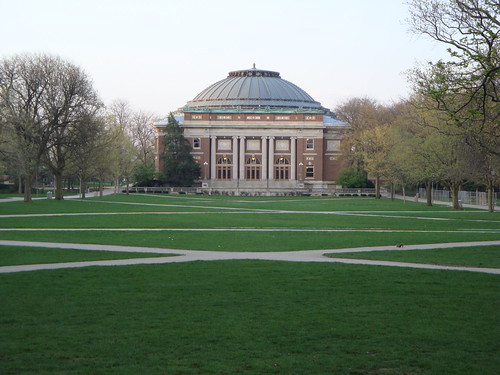
Justification: One of the choices of buildings we were given was Foellinger Auditorium on the University of Illinois campus. I have admired that building before because it is colonial and I think it looks great at the end of the quad. Here is a sample picture from the U of I website if you're not familiar with the building:
Project: Architecture illustration
Specifications: Create an illustrated poster of a landmark building in Champaign-Urbana.
Reproduction: The poster is 11x17 inches and will printed with a 4-color process. The finished poster must have an original illustration, the name of the building, a short paragraph describing the style of the building, a typographic PACA logo, and PACA's web address.
Justification: One of the choices of buildings we were given was Foellinger Auditorium on the University of Illinois campus. I have admired that building before because it is colonial and I think it looks great at the end of the quad. Here is a sample picture from the U of I website if you're not familiar with the building:
Subscribe to:
Posts (Atom)