Showing posts with label gds120. Show all posts

Saturday, May 5, 2012

Why graphic designers live tortured lives


My friend told me the only reason he knows about kerning is because of this comic (www.xkcd.com).

Thursday, April 26, 2012

Kimberly-Clark inspiration

In the AIGA collection (volume 365: 31) from 2010 I found this funny product that I thought was really appropriate since summer is coming. Because of our products this semester I guess I've been thinking a lot more about product design and this one really stood out to me. It's eye-catching but also a little confusing... are we supposed to want to eat the tissue box? By the design firm Kimberly-Clark.


Thursday, April 19, 2012

Inspiration of Method

Method is a brand of household products that are environmentally and socially conscious. They also have great product design and won the AIGA 2010 Corporate Leadership Award. The design of their products is very clear clean, which is good for cleaning supplies. The design visually and to the products (which have plant-based formulas or feature biodegradable corn-plastic) are hopefully leading the way to a future in which businesses and companies are more conscientious of their products.


Jacqui Oakley inspiration

Jacqui Oakley did this illustration for an album cover, featured in AIGA. The colors and shapes within the lion's head gives the illustration vibrance and movement while the color palette is, although colorful, still regal. The layout and design of the cover was done by Poly.


Thursday, April 12, 2012

Andy Gilmore inspiration

AIGA's blog design envy featured artist Andy Gilmore, whose work looks very geometric close up but far away is more organic and emotive.


I think the piece shows a lot of unity through color and balance because it is almost symmetrical. I think what keeps it organic is the rhythm present in the patterns.

Thursday, April 5, 2012

James Gurney inspiration

James Gurney was featured in the Society of Illustrators "Spectrum" exhibit that features the best contemporary art in 2009. He is famous as an author/illustrator and particularly for his work Dinotopia. This story details the adventure of a father and son who are ship wrecked on an island on which dinosaurs have not gone extinct and more or less live peacefully with people. The "journal" records how people and dinosaurs have adapted to living with each other and the ways of the dinotopia culture.

This was one of my favorite books as a kid, and the illustrations are absolutely phenomenal. I remember looking at them for hours--the attention to detail visually and also with thought to the imaginative culture is impressive. If you haven't seen this book, I highly recommend picking it up sometime. Here are some sample images below.


Thursday, March 8, 2012

Kinuko Y. Craft inspiration

My inspiration comes from K.Y. Craft, who was inducted into the Society of Illustrators Hall of Fame in 2008. The example of her work below beautifully illustrates her ability to capture the subtleties of light and dark. The subtleties add to the textures and delicacy of the image and the geisha really well. I also like how her lights and dark have slightly different hues, seen especially in the clouds and water in the background of this image.


Thursday, March 1, 2012

Marcos Chin inspiration

This week my inspiration is from Marcos Chin. The image below I found in the Illustrators 54 magazine. I liked it because of the various textures and colors of the clothes, and how it reminded me of the people (in Africa?) who stretch their necks out by putting on metal bands. Maybe Marcos is making some kind of social commentary, like how we think that other cultures are strange but only because we are accustomed to our own culture's peculiarities.


Thursday, February 23, 2012

Mark Summers inspiration

This week's inspiration is from Mark Summers (at Richard Solomon). He is very good at doing high detailed and refined scratchboard with color. The picture below of the cat shows the rule of thirds and depth with the amount of texture from the scratchboard.


Thursday, February 16, 2012

Evynd Earle inspiration

Evynd Earle is an artist from California who passed away in 2000. I was first introduced to his work in my home--my parents used to live (before I was born) in California near where Evynd worked. They were both struck by his paintings, and as a result while I was growing up I was familiar with a handful of serigraphs (think silkscreens with 50+ colors) of his work hanging throughout my parent's house.

Evynd's first big commercial job was as the background artist for the Disney film Sleeping Beauty, and he worked there for ten years. He is well known for his very unique style of landscapes--there is really none other like him, in my opinion.

His style shows incredible rhythm with the lively shapes and personalities of trees and often bright colors contrasted on a black background. His paintings also show depth with textures in stipling and again through color. Here are some examples of his serigraphs below (click for larger image). All of these images are from his website.


Thursday, February 9, 2012

Andrea Cobb inspiration

The artist I like this week is Andrea Cobb. Her style uses primarily vector art with layers of embellishments and details. In this illustration below, she uses several different types of lines and shapes to create texture. The dark teal and brown-red color scheme is complementary, but variation in the shade adds dimension and variety as well. I also like how the woman is mostly created by the negative space of the objects, bringing emphasis to her features and hair.


Thursday, February 2, 2012

Patrick George inspiration

Patrick George's art creates a concept with minimal shapes and bright colors. The result is a strong and eye-catching design. The design on the left shows unity with color, and grouping. It has symetrical balance, except for the sailboat so that it is emphasized. The design on the right I thought was well done because it describes Lolita in a simple and effective way--Lolita's youth and seduction (in the narrator's mind) is much represented by the sucker.


Tuesday, January 24, 2012

Owen Davey and Charlie Harper inspiration

This week's inspiration comes from Owen Davey, who was featured in the October 2011 Computer Arts magazine. One that particularly caught my attention is below, an album cover for The Leisure Society, an indie band. This type of intricate illustration is fascinating to me--the different fish and animals make up different shapes and makes one want to keep looking at it to discover new things. Kind of like a Where's Waldo image, except those have too much unity and are bland at a glance.


Then I read that Owen himself was inspired by Charley Harper, who is an amazing and well-known illustrator. Charley is famous for doing biological, environmental, ecological, conversational illustrations. In fact, I was first introduced to him by my undergrad ecology professor and advisor, who had posters by Charley in his office, one for every biome.

Charley is well known for his minimalist style, in which animals are made up of simple shapes and lines. I highly recommend checking out his website (linked above). Here is an example of his work below.


Thursday, January 19, 2012

Mitch Frey inspiration

Here is some inspiration by Mitch Frey, who works primarily with a digital technique, especially Illustrator. I liked the image below because I think the bright colors and well-defined shapes and shades in the vector format gives a very clean look. The glossy highlights remind me of those miniature models for antique objects like trains.


Mitch also has a couple other styles, including some retro with stylized shapes. In fact, if you go to his website, he has an interesting roll-over image that illustrates his similar-yet-different styles.

Tuesday, January 17, 2012

Website design inspiration

Here are some inspirations for a website design. I like websites that are simple and useful--unless you're specifically an artist who wants to show of your designing/programming/illustration skills or projects, I don't usually like complicated websites.

I liked the following designed because they impliment what I think an excellent website should be: clean, simple, and attractive. I also chose websites that featured illustrations, which is something I'd like to include in my website design.

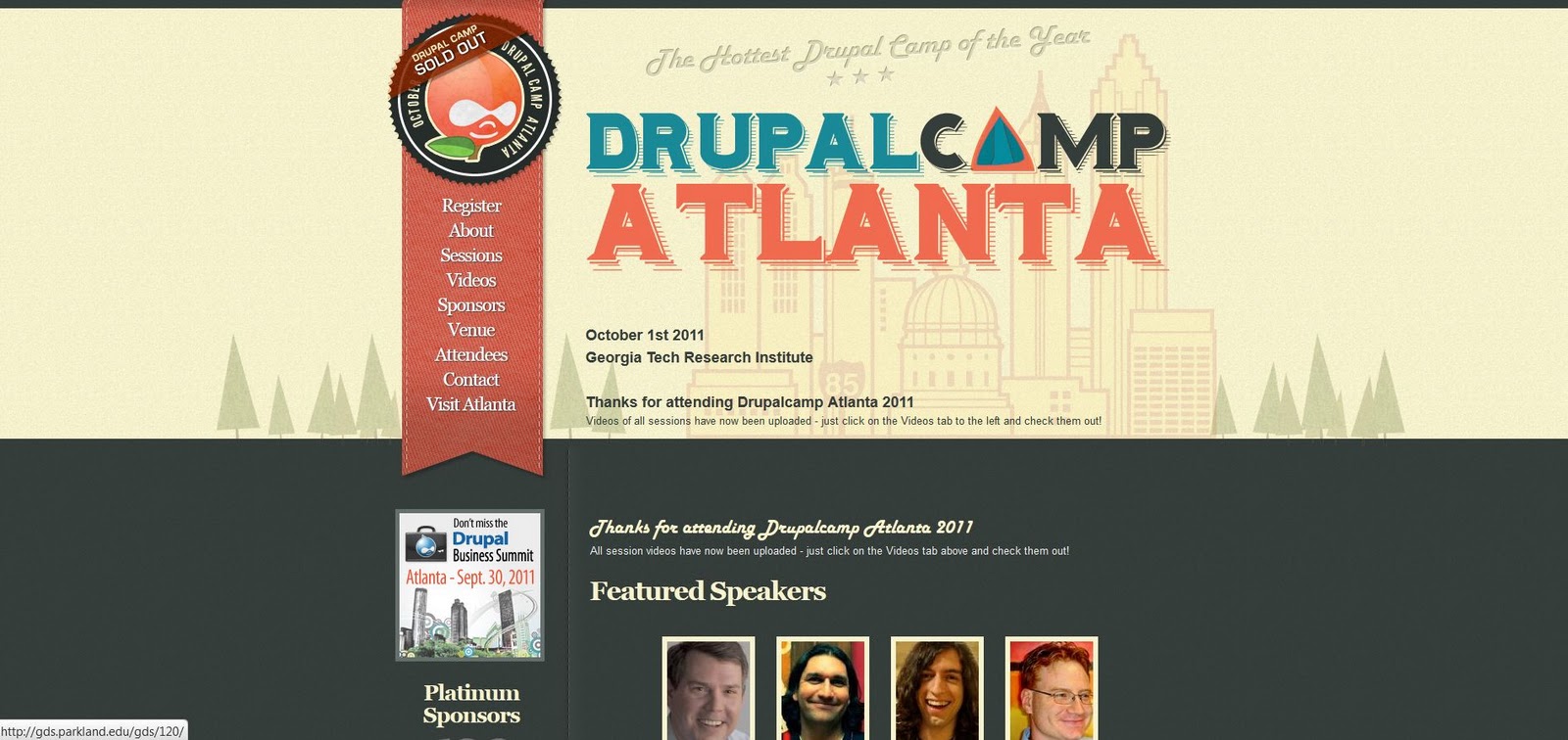
This one is my favorite--a website for DrupalCamp Atlanta, a conference for people associated with Drupal, a content management system (think website design). I like the subtle details of the 'stitched' style and bookmark navigation bar, the illustrated typeface, and how the front page features a larger illustration that has a treeline motif repeated on the inside pages.


The next example is for a software called Iceberg and has an even more simplified page with a single illustration for emphasis.


The final design is a personal website for an artist Adit Shukla. I think the red color is pretty extreme and could be less saturated for a warm, inviting feeling without as much shock value. But, the header illustration and how it leads into the navigation bar is very creative.