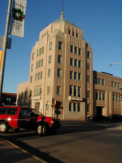
I learned how to do some really useful things, like straigtening the photo and using distort to increase the perspective on the building, to make it look taller (and more impressive?) than it actually is in the photo. We also created vanishing points and reference lines to help use line up our shapes. Here's a preview of what the reference photo looked like when we were done:
Then we put the image in Illustrator and started tracing! I learned some handy tricks I wouldn't have thought of if I was trying it on my own. For instance, instead of tracing each window individually, we made a long, vertical rectangle over each column of windows, then made horizontal rectangles the same color of the building to fill in the negative space. Here's an in-progress shot:
Next (this week, everything else was done last week) we practiced separating the objects and layers appropriately so the image would print correctly in a silkscreen process. For example, in the original Illustrator file, the sky is just a blue rectangle behind the building. But in a silkscreen process, it needs to have the negative of the building taken out, because otherwise it would look weird having the tan on top of the blue (it would probably look weird). However, black can go on top of anything--in fact, you get a "rich" or deeper black color if it is printed on top of other colors, as opposed to the white paper.
I also learned some neat short-cuts for dealing with text, such as Ctrl + Shift + > or < for increasing or decreasing text size and Alt + left arrow or right arrow for creating spaces between the letters (as with "Illinois" on the poster) which is called tracking. These are the final layers, ready for printing! We will be printing our original illustrations for a travel poster using this method, too!


No comments:
Post a Comment