This exercise was to make an isometric drawing, which is a fake perspective. (It's fake because there is no vanishing points, and all edges are parallel.) It's pretty simple yet effective.
Check out my Blog for recent updates on what I've working on or art that inspires me, see the progression of selected works on my Process Page, or browse my Portfolio for finalized pieces.
Saturday, October 22, 2011
Friday, October 21, 2011
Map exercise
This exercise was in preparation for a project. We replicated this simplified map of the Champaign-Urbana area that highlighted fun things to do on a Friday night. This was all done in Illustrator.
Some things I learned in this exercise would be how to make the double line (make a line with a thick stroke and then outline the stroke) and also using a font called Carta that has the dingbats (little images) for the highway symbols. I didn't really like this exercise because it took a long time (with all the text and icons) and felt like busy work...
Thursday, October 20, 2011
Inspiration: Kadir Nelson
This week I decided to check out Kadir Nelson, a name I've seen several times in the Society of Illustrator books. Indeed, he has won quite a few awards in the past few years from the Society.
This ad for a festival sponsored by Coca-Cola has wonderful movement in it. His people are dynamic and real looking, almost lifting off the page. This one below is of Mighty Josh from a book called "We Are the Ship," about the Negro League Baseball. The lighting is superb and portrays the pre-game tension-within-stillness tone well. (Click for larger image).
Wednesday, October 19, 2011
Study sketch
Sketches of some noses, mostly. Not very detailed, but this is from my head and not looking at anyone. I'd like to do it again with some models :)

Tuesday, October 18, 2011
Editorial spot: Concepts
The news article I decided to do is an article about a "new technology [that] uses brain scans to see what a person is watching." It appeared on ScienceNews.org, titled "The mind's eye revealed." If you're interested in the most recent paper about it by the scientists, it was published in Current Biology.*
The tagline implies something that isn't totally true--the scientists didn't just hook a computer up to a brain and record what the person was watching. They used a fMRI to record brain signals for a few hours while the three participants watched movies. A computer recorded the signals and used them with the videos to create a model for what the participants were seeing. After the program was "trained" the participants were shown a couple more video clips, and this time the computer read the signals and picked from a library of 1-second YouTube video clips something close to what the model determined the participant was watching. The researchers then averaged the model's top 100 choices into a compiled video of blurry shapes that are remarkably (and eerily) similar to what the participants were watching. I've included a video clip from the original article at the end.
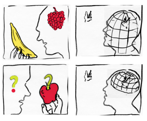
Anyway, here are some concept sketches for the editorial spot:
There are a lot of different ideas I have... not quite sure which one I like most so far. Right now I'm favoring the TV connected to the head showing a brain on the screen.
More on the research:
Link to video of what the participants saw and what the computer reconstructed. (You might have to be a member of the journal to see it...let me know if it doesn't work.)
*Citations:
Nishimoto, S, AT Vu, T Naselaris, Y Benjamin, N Yu, and JL Gallant. 2011. Reconstructing visual experiences from brain activity evoked by natural movies. Current Biology 21: 1641-1646.
The tagline implies something that isn't totally true--the scientists didn't just hook a computer up to a brain and record what the person was watching. They used a fMRI to record brain signals for a few hours while the three participants watched movies. A computer recorded the signals and used them with the videos to create a model for what the participants were seeing. After the program was "trained" the participants were shown a couple more video clips, and this time the computer read the signals and picked from a library of 1-second YouTube video clips something close to what the model determined the participant was watching. The researchers then averaged the model's top 100 choices into a compiled video of blurry shapes that are remarkably (and eerily) similar to what the participants were watching. I've included a video clip from the original article at the end.
Anyway, here are some concept sketches for the editorial spot:
There are a lot of different ideas I have... not quite sure which one I like most so far. Right now I'm favoring the TV connected to the head showing a brain on the screen.
More on the research:
Link to video of what the participants saw and what the computer reconstructed. (You might have to be a member of the journal to see it...let me know if it doesn't work.)
*Citations:
Nishimoto, S, AT Vu, T Naselaris, Y Benjamin, N Yu, and JL Gallant. 2011. Reconstructing visual experiences from brain activity evoked by natural movies. Current Biology 21: 1641-1646.
Monday, October 17, 2011
Holiday card: Concepts
Here are my best ideas for some whimsical illustrations of Parkland cobras in winter scenes.
The first one is my favorite, but I will probably add a window across from the snake to add more balance to the composition. The "snowsnake" one would be difficult to make believable. The third one is fine but I just don't like the idea as much as the first.
Thursday, October 13, 2011
Style inspiration: Yuko Shimazu
I've seen a lot of Yuko Shimazu's work in the Society of Illustrators and also American Illustration. She has received many awards, and seems to be everywhere (though I don't remember seeing her work in daily life). Her art is dynamic and thought-provoking, detailed and has a lot of visual depth and rhythm. It's hard to know where to start, because her art seems to be so well known, but I've picked out a few that I think exemplify her art's characteristics. I also like that they have female 'protagonists,' because they are awesome.
Personal artwork, featuring Panda Girl, the first Asian-American superhero.
Ad for "NPR and me."
Ad for Target.
She is also known for some more sexually explicit work, which you can check out on your own, if you wish.
Personal artwork, featuring Panda Girl, the first Asian-American superhero.
Ad for "NPR and me."
Ad for Target.
She is also known for some more sexually explicit work, which you can check out on your own, if you wish.
Wednesday, October 12, 2011
People of Chicago sketch
Here's a sketch I did while in Chicago this weekend. I had some time to wait for a train, so I spent it in a Starbucks, getting inspiration from the random people that walked in. It was a fantastic exercise, to try to portray the diversity of people here. Makes me want to live in the city again.
I want to start a webcomic soon/someday, so it was a good way to think about characters and character design.
Tuesday, October 11, 2011
Newspaper editorial spot: Inspiration
Here is one by Chris Gash, who has done spots for the NYT since 2004. I like that it is pretty simple but presents object agnosia--the inability to recognize objects--in a very insightful way that is visually appealing.
What's interesting is that Gash also posts his concepts or "honorable mentions" on his sketch blog. Here are some of his other sketches for the object agnosia article:
Here are a couple other examples of recent spots that I thought were visually interesting, by Joyce Hesselberth and Yvetta Fedorova. The illustrations take a interesting twist or point from the article and present it in a way that catches the eye and makes readers interested enough to read the article.
Origami instructional final
Here is the final mock-up of my instructional illustration, made in InDesign. What do you think? Click the image to embiggen.
Newspaper editorial spot: Brief
Client: The News Gazette (Central Illinois)
Project: Newspaper editorial spot illustration
Specifications: Create a spot illustration to accompany feature article for The News-Gazette.
Reproduction: The art will be printed in black and white, two column inches wide.
Justification: In college I liked to read The Science Times, a special part of The New York Times that came out every Tuesday. The short articles about new scientific findings frequently had spot illustrations with them. I plan to find a scientific article and design an illustration for it.
Project: Newspaper editorial spot illustration
Specifications: Create a spot illustration to accompany feature article for The News-Gazette.
Reproduction: The art will be printed in black and white, two column inches wide.
Justification: In college I liked to read The Science Times, a special part of The New York Times that came out every Tuesday. The short articles about new scientific findings frequently had spot illustrations with them. I plan to find a scientific article and design an illustration for it.
Monday, October 10, 2011
Silkscreen travel poster: Final
Here is my Rainier poster prettied up with some changes incorporated--mainly the text of the title more closely matching the Amtrak logo, and creating a softer brown with the rocks in the foreground.
I also worked on a poster for Mt. Shasta, using an awesome palette that I really love. The problem is that it is 4 PMS colors, and we are supposed to only do 3 for the sake of the silkscreeners who are helping us.
Holiday card: Inspiration
I like whimsical cards with illustrations, so for the Parkland College holiday card, I wanted to do something light-hearted and cheerful. In researching some ideas I remembered B. Kliban, who was famous for his cat illustrations.
I like to draw animals, so I am thinking of doing a winter-themed illustration with Parkland's cobra. Here is a couple examples of Kliban's work. I like how sometimes the cats have more cat-like characteristics and sometimes they are more human-like.
Kliban's art is very detailed in terms of style (especially his backgrounds), so I would like to do something more simple like this line drawing with crisp, light color:
I like to draw animals, so I am thinking of doing a winter-themed illustration with Parkland's cobra. Here is a couple examples of Kliban's work. I like how sometimes the cats have more cat-like characteristics and sometimes they are more human-like.
Kliban's art is very detailed in terms of style (especially his backgrounds), so I would like to do something more simple like this line drawing with crisp, light color:
Holiday card: Brief
Client: Parkland College (Champaign, IL)
Project: Holiday card illustration
Specifications: Create an illustration for the Parkland holiday card. The illustration shouldn't indicate any particular religious traditions as to be inclusive of the entire Parkland community. The card should reflect Parkland's culture, campus, and philosophy.
Reproduction: The art will be printed in CMYK on a card that fits inside a standard envelope and printable by Parkland's in-house printer. The envelope must include the Parkland logo and return address. The card must include the artist's name somewhere.
Justification: I like whimsical holiday illustrations, especially with animals. Parkland's mascot is the cobra, so I would like to do an illustration with the cobra in a winter-themed composition. Winter break from school is usually a relaxing, fun time and I'd like to relate that in my art in a humorous or light-hearted way.
Project: Holiday card illustration
Specifications: Create an illustration for the Parkland holiday card. The illustration shouldn't indicate any particular religious traditions as to be inclusive of the entire Parkland community. The card should reflect Parkland's culture, campus, and philosophy.
Reproduction: The art will be printed in CMYK on a card that fits inside a standard envelope and printable by Parkland's in-house printer. The envelope must include the Parkland logo and return address. The card must include the artist's name somewhere.
Justification: I like whimsical holiday illustrations, especially with animals. Parkland's mascot is the cobra, so I would like to do an illustration with the cobra in a winter-themed composition. Winter break from school is usually a relaxing, fun time and I'd like to relate that in my art in a humorous or light-hearted way.
Sunday, October 9, 2011
Reflection of the art process
The process outlined in the project
assignments usually goes research, choose client, incubation, concept, proof,
final. My own process generally goes the same way with a few exceptions. To me,
the client is generally more important than the inspiration. I think this is
closer to the real world because generally one gets a job from a client rather
than getting an inspirational idea first and then finding a client. To me, the
client is the framework for the whole project, and I probably spend more time
investigating the subject or client for inspiration more than other artists.
When I
investigate other artists, it is generally for an inspiration in style. I don’t
spend as much time researching artists because I know what I like when I see
it, and once I see something I like, I stick with it. At this point I don’t
really care how complicated the style is or how I will do it.
At the
sketching point, depending on the project, I may have one or two ideas or
several ideas. I generally don’t make that many sketches because I usually find
a good idea that might develop further. At this point I am already looking at
reference images. Rather than have an idea in mind and then find reference
photos to fulfill that vision, I usually have a combination of being inspired
by my own thoughts and images I see. Each is a spring board for the next idea
or image search. I don’t think I ever have to make 10 sketches, because like I
said, my first or third idea is usually my favorite.
At the concept stage, I begin working at the computer by
scanning in my best sketch or hand-tracing reference images or sketches (using
a tablet). I generally don’t stray from my intentions or inspiration, except
when playing with font or copy placement after the illustration is done.
For my final drafts, I take feedback very seriously. I
generally try all suggestions and keep them unless there is something, in my
opinion, which does not work as well. But, I try not to leave any “stone
unturned” so to speak. Often times I will go back to an image days or weeks later and find something I will want to change. But in the end, it's up to the client, isn't it?
Saturday, October 8, 2011
Custom blend exercise
The cord was made by layering strokes of various shades and widths and blending them. For example, replicating the cord path three times and changing the bottom to a 9-point dark stroke, then a 6-point medium stroke, and 2-point light stroke on top of it.
The shapes were traced by hand over a photograph and the colors were eye-droppered from the same photo. I can't wait till I have time to use this technique again!
Friday, October 7, 2011
Exercise in depth
I liked this exercise, particularly because utilizing depth is a good excuse to play with texture, which I like a lot. I was a bit creative in the content for this exercise. Did you notice? It spells my name.
Thursday, October 6, 2011
Style inspiration: Scott McKowen
This week I am inspired by Scott McKowen and his textured work.
I really like the high contrast of his images, which give a really interesting play to light and darkness. The water surface in the image above is done perfectly--and I imagine that it would be very hard to do. I believe the work is all scratchboard and colored by hand. I like how even flat surfaces, like surrounding the oyster below, have lines and movement that contribute to the illustration.
Wednesday, October 5, 2011
Landscape sketch
As much as I love nature, I'm really bad at drawing it. I can never get the textures right and get the space and depth to come across as well. Unless there are buildings--buildings I can do. But, I do love nature, so I gave it a shot. This is a sketch I drew while referencing a photo from Cougar Mountain in Washington state.
Then I tried coloring it with Illustrator brushstrokes... hard to do.
Tuesday, October 4, 2011
Instructional proof
Here are the illustrations for the origami step-by-step instuctions. I just need to lay them out on a page, I need InDesign to do it, which I only have at school, so I'll have to do it later.
I think I'm also going to make the blue lighter, because otherwise it creates a strange phenomena of making the black lines appear to be lined in gray.
Subscribe to:
Posts (Atom)