Thursday, February 16, 2012

Evynd Earle inspiration

Evynd Earle is an artist from California who passed away in 2000. I was first introduced to his work in my home--my parents used to live (before I was born) in California near where Evynd worked. They were both struck by his paintings, and as a result while I was growing up I was familiar with a handful of serigraphs (think silkscreens with 50+ colors) of his work hanging throughout my parent's house.

Evynd's first big commercial job was as the background artist for the Disney film Sleeping Beauty, and he worked there for ten years. He is well known for his very unique style of landscapes--there is really none other like him, in my opinion.

His style shows incredible rhythm with the lively shapes and personalities of trees and often bright colors contrasted on a black background. His paintings also show depth with textures in stipling and again through color. Here are some examples of his serigraphs below (click for larger image). All of these images are from his website.


Wednesday, February 15, 2012

Andy Needham inspiration

In terms of motion design, I am a sucker for music videos. Here is a random one (I don't know the band, but I like the video) I found by Andy Needham. I like the interesting combination of 2D/3D. It is also interesting to see how directors change aspects throughout the movie to keep a person's interest. A song is, usually, very repetitive and the art has to reflect that. But Andy introduces some variety with the red 'paint' and breaking the repetition with different visual styles--similar enough to keep unity in the video, though.


Thursday, February 9, 2012

Andrea Cobb inspiration

The artist I like this week is Andrea Cobb. Her style uses primarily vector art with layers of embellishments and details. In this illustration below, she uses several different types of lines and shapes to create texture. The dark teal and brown-red color scheme is complementary, but variation in the shade adds dimension and variety as well. I also like how the woman is mostly created by the negative space of the objects, bringing emphasis to her features and hair.


Tuesday, February 7, 2012

Eva film title inspiration

This is the film title for a movie called Eva. I'm pretty sure it's 3D animation, but the lighting is superb! You can also see faces and people reflected in some of the 'glass.' I imagined that the artists were put to the task of making memory visual.


Thursday, February 2, 2012

Patrick George inspiration

Patrick George's art creates a concept with minimal shapes and bright colors. The result is a strong and eye-catching design. The design on the left shows unity with color, and grouping. It has symetrical balance, except for the sailboat so that it is emphasized. The design on the right I thought was well done because it describes Lolita in a simple and effective way--Lolita's youth and seduction (in the narrator's mind) is much represented by the sucker.


Wednesday, February 1, 2012

The Seed inspirational movie

I liked this film, called 'The Seed' by Nexus because of it's creative use of combining 2D animation drawings and 3D paper stop-animations. There was a creative and unpredictable way that events and objects were presented--for instance, the body. We all know that the stomach is where food is digested, but making it look like the food is melting into the acid and the intestine being a maze is surprising and is what delights me about animation. I also like the attention to detail, such as the music being damened under water--it is tied in so well and so naturally that I almost didn't notice.

You can see the movie with this link:


Wednesday, January 25, 2012

I made a spaceship!

A 3D image, actually. (If only it were real!)
This is one of the first thing's I've made in my 3D animation class that was actually cooler than a photo frame or a window.

It only took about 45 minutes--although our teacher walked us through the whole thing. The first image is what I actually made, by 'extruding' (expanding the sides of) a simple cube, part by part. Then Maya (the 3D software program) makes it soft and aerodynamic with the click of a button.

It's pretty cool! I'm excited to do more.


Tuesday, January 24, 2012

Owen Davey and Charlie Harper inspiration

This week's inspiration comes from Owen Davey, who was featured in the October 2011 Computer Arts magazine. One that particularly caught my attention is below, an album cover for The Leisure Society, an indie band. This type of intricate illustration is fascinating to me--the different fish and animals make up different shapes and makes one want to keep looking at it to discover new things. Kind of like a Where's Waldo image, except those have too much unity and are bland at a glance.


Then I read that Owen himself was inspired by Charley Harper, who is an amazing and well-known illustrator. Charley is famous for doing biological, environmental, ecological, conversational illustrations. In fact, I was first introduced to him by my undergrad ecology professor and advisor, who had posters by Charley in his office, one for every biome.

Charley is well known for his minimalist style, in which animals are made up of simple shapes and lines. I highly recommend checking out his website (linked above). Here is an example of his work below.


Monday, January 23, 2012

Augmented reality ad


Here is a creative idea for a web ad--one that uses augmented reality. For those of you who don't know, augmented reality involves using technology that interacts somehow with reality. In this case, the ad watches you with a webcam as you use your head to score a soccer goal.

It's a lot easier to get what I mean if you watch the video above. What I don't know is if the ad actually detects the movement of one's head or if it automatically bounces off the frame of the video--for instance, what happens if you don't move at all?

And, if you have a webcam, you can try it out yourself (I don't, so I couldn't try it) following this link.

Thursday, January 19, 2012

Mitch Frey inspiration

Here is some inspiration by Mitch Frey, who works primarily with a digital technique, especially Illustrator. I liked the image below because I think the bright colors and well-defined shapes and shades in the vector format gives a very clean look. The glossy highlights remind me of those miniature models for antique objects like trains.


Mitch also has a couple other styles, including some retro with stylized shapes. In fact, if you go to his website, he has an interesting roll-over image that illustrates his similar-yet-different styles.

Wednesday, January 18, 2012

Nikon Universcale motion design

Nikon, who makes visualization equipment from microscopes to cameras to telescopes, has an interesting motion graphic that shows the relative size of several objects from our galaxy to a single atom. You can view the interactive animation here.

Not only is it interesting, I like that this motion graphic has the potential to be a learning tool.


Tuesday, January 17, 2012

Website design inspiration

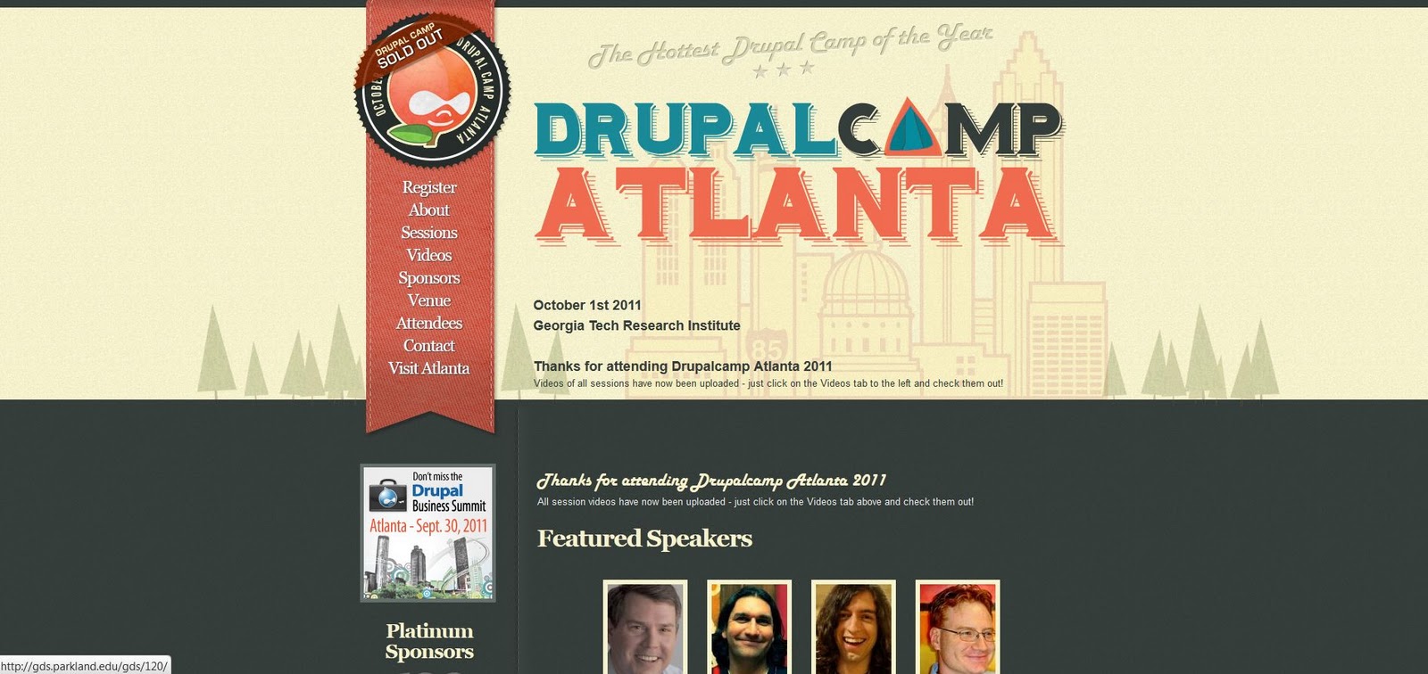
Here are some inspirations for a website design. I like websites that are simple and useful--unless you're specifically an artist who wants to show of your designing/programming/illustration skills or projects, I don't usually like complicated websites.

I liked the following designed because they impliment what I think an excellent website should be: clean, simple, and attractive. I also chose websites that featured illustrations, which is something I'd like to include in my website design.

This one is my favorite--a website for DrupalCamp Atlanta, a conference for people associated with Drupal, a content management system (think website design). I like the subtle details of the 'stitched' style and bookmark navigation bar, the illustrated typeface, and how the front page features a larger illustration that has a treeline motif repeated on the inside pages.


The next example is for a software called Iceberg and has an even more simplified page with a single illustration for emphasis.


The final design is a personal website for an artist Adit Shukla. I think the red color is pretty extreme and could be less saturated for a warm, inviting feeling without as much shock value. But, the header illustration and how it leads into the navigation bar is very creative.


Tuesday, January 3, 2012

Illustrated novel, part 5

This is part 4 of a series of illustrations that I developed for the book A Wrinkle in Time, by Madeleine L'Engle. This is a full page, full-color illustration of the planet Uriel, the first planet to which the children tesseract. Uriel is the mountainous home of beautiful centaur-like creatures with wings.


Tuesday, December 27, 2011

Illustrated novel, part 4

This is part 4 of a series of illustrations that I developed for the book A Wrinkle in Time, by Madeleine L'Engle. This is earlier in the book when the children (Meg, her brother Charles Wallace) discover a grave threat to our planet.


Tuesday, December 20, 2011

Illustrated novel, part 3

This is part 3 of a series of illustrations that I developed for the book A Wrinkle in Time, by Madeleine L'Engle. This is near the end of the book, where the main character Meg finds her father on another planet.


Tuesday, December 13, 2011

Illustrated novel, part 2

This is part 2 of a series of illustrations that I developed for the book A Wrinkle in Time, by Madeleine L'Engle. This is the introduction to chapter 2, with an illustrated capital letter.


I chose to do a starry background, since the novel is science fiction and involves space travel. The manner in which they travel is by tesseract, or a "wrinkle in time." A tesseract involves passing through the fifth dimension; the concept is explained to Meg (and the reader) with the demo of an ant travelling across a string. So, I also included a string to represent the tesseract for the letter illustration.

Monday, December 12, 2011

Biography book cover final

Changes I made for the final were adding details to her face and changing the pattern on the chair to be less distracting. People seemed to like the 'melting' chair effect.


Here's a mock-up of how the book would look:


Tuesday, December 6, 2011

Illustrated novel: title page (part 1)

The next few weeks I will present five illustrations that I developed for the book A Wrinkle in Time. This is the title page with Meg and Aunt Beast, full page in black and white.


The title page illustration features Meg, the main character, being carried by an alien who helps her recover when she is almost frozen to death. The aliens live on a planet that gets hardly any light so they are blind. They also happen to have four arms with lots of tentacles. Meg fondly calls her alien caretaker Aunt Beast. It was perhaps my favorite part of the whole book, and I remember Aunt Beast fondly myself.

Monday, December 5, 2011

Biography book cover proof

And here it is, the proof! I think it turned out pretty well. While I was making it, I decided that I really liked the idea of parts being unfinished and having her face have the most detail for emphasis. I will probably add even more detail to her face--blending the shadows and adding highlights to make it have more depth. I changed the background from grays to brighter blues (too depressing otherwise). The spine design is there as well. Click for bigger images.


Thursday, December 1, 2011

Interesting tools for colorblindness

Have you ever wondered what it's like to be colorblind? Do you wonder what your website looks like to someone with colorblindness?

Here is a website that will let you know: Colorblind Filter

Just put in a website and you can view it like someone who is colorblind (my own colorblindness is most similar to the 'anomalous red cone' filter). Some websites, like those with flash applications, don't work.

I occasionally try tests to help myself learn to compensate for my colorblindness--although it is a biological and inherited trait that has no 'cure' or 'fix,' I think that to a certain degree, familiarity with color can help anyone with color recognition and discrimination.

I found this website today, a Hue Test that will tell you what hues (colors) you have trouble discerning.

Take the simple test yourself, before you look at my results below (I don't want to give it away).

Take the Hue Test here. (Takes about 3-5 minutes)

Here are my results below...
.
.
.
.
.
.
.
.
.
.
.
.
.
.
.
.
.
.
.
.


(Click to see bigger images)
Were your results better?