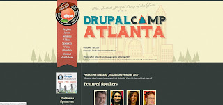
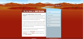
I liked the following designed because they impliment what I think an excellent website should be: clean, simple, and attractive. I also chose websites that featured illustrations, which is something I'd like to include in my website design.
This one is my favorite--a website for DrupalCamp Atlanta, a conference for people associated with Drupal, a content management system (think website design). I like the subtle details of the 'stitched' style and bookmark navigation bar, the illustrated typeface, and how the front page features a larger illustration that has a treeline motif repeated on the inside pages.
The next example is for a software called Iceberg and has an even more simplified page with a single illustration for emphasis.
The final design is a personal website for an artist Adit Shukla. I think the red color is pretty extreme and could be less saturated for a warm, inviting feeling without as much shock value. But, the header illustration and how it leads into the navigation bar is very creative.


I can see why you chose these designs as inspiration. Clean and simple layouts are really good for professional websites and blogs. Layouts like these take away the distraction and amplify the website’s purpose. When it comes to professional websites, company websites, or sales-oriented websites, less is definitely more.
ReplyDelete-- Darryl Tay
This comment has been removed by the author.
ReplyDeleteGet Your Dream Website Built in Delhi Today!
ReplyDeleteBook the Best Web Design Team in Delhi Now
Launch Your Business Online with Experts in Delhi
Affordable Web Development Packages in Delhi – Book Now
Free Website Consultation in Delhi – Let’s Build Together
Your Business Needs a Website – We’re Delhi’s Best
Start Your Online Journey with Delhi’s Top Web Team
Schedule Your Web Design Consultation in Delhi Today
Need a Website? Let Delhi’s Best Design It for You
Ready to Launch? Work with Delhi’s Top Web Developers
Nice blog, thanks for sharing this informative content! I’ve been exploring visual CMS tools recently, and this gave me some great insights. If anyone’s looking for a reliable Builder io development company in Australia, RW Infotech seems like a solid choice.
ReplyDeleteThe New Marketplace: Why Businesses Must Embrace Being Online
ReplyDeleteGoing Digital: The Smartest Move Your Business Can Make Today
Digital Visibility: Your Hidden Superpower for Business Success
The Surprising Business Benefits of Being Seen Online
From Obscure to Omnipresent: The Power of Digital Visibility
Why Every Business Owner Should Prioritize Being Online
The Silent Killer: How Lack of Digital Presence Impacts Revenue
Being Online Is No Longer Optional — Here’s Why
How to Make Your Business Unmissable Online
The Business Growth You’re Missing Without Digital Visibility
Build Your Dream Website with Delhi’s Top Expert
ReplyDeleteLaunch Your Website with Confidence – Hire Delhi’s Best
Trusted by 100+ Clients – Web Developer in Delhi
Delhi Web Developer Who Understands Your Business
Convert More Visitors with Expert Website Development in Delhi
Website Developer in Delhi Who Delivers on Time
Website Development That Grows Your Business – Delhi Expert
One-on-One Website Consultation with Delhi’s Top Developer
Get Custom Web Solutions from Experts in Delhi
Delhi Website Developer Known for Quality & Performance
Fast & Secure Website Development in Delhi
ReplyDeleteHigh-Converting Website Design & Development in Delhi
Mobile-Friendly Website Development Experts in Delhi
UX/UI Website Design and Development in Delhi
Modern Web Design Services for Delhi Businesses
Custom Web Solutions with Advanced Features in Delhi
Speed-Optimized Website Development in Delhi
User-Centric Web Development Company in Delhi
SEO-Ready Website Development in Delhi
Interactive & Engaging Website Design in Delhi
Visit Techlancers a leading staff augmentation services in dubai offering complete expertise in staff augmentation domain.
ReplyDeleteYour recent post on UI/UX design service insights is truly invaluable. The way you dissected user journey mapping and wireframing techniques demonstrates remarkable expertise. I especially appreciated how you combined visual hierarchy principles with real-world examples of interactive prototypes. Your clear, engaging explanations empower designers at all levels to elevate their work and deliver more intuitive interfaces. Highlighting accessibility considerations alongside aesthetic decisions shows a holistic approach to user-centered design.
ReplyDeleteThis design shows a deep understanding of both user psychology and branding. The pages feel balanced, the visuals are attractive, and everything is easy to navigate. It’s proof that web design in Delhi Ncr is reaching new levels of quality. Your ability to create something both beautiful and functional is truly commendable. The overall experience feels smooth and well-organized, making the site instantly appealing. Amazing work—you’ve done a brilliant job capturing modern design principles.
ReplyDelete