A 3D image, actually. (If only it were real!)
This is one of the first thing's I've made in my 3D animation class that was actually cooler than a photo frame or a window.
It only took about 45 minutes--although our teacher walked us through the whole thing. The first image is what I actually made, by 'extruding' (expanding the sides of) a simple cube, part by part. Then Maya (the 3D software program) makes it soft and aerodynamic with the click of a button.
It's pretty cool! I'm excited to do more.
Check out my Blog for recent updates on what I've working on or art that inspires me, see the progression of selected works on my Process Page, or browse my Portfolio for finalized pieces.
Wednesday, January 25, 2012
Tuesday, January 24, 2012
Owen Davey and Charlie Harper inspiration
This week's inspiration comes from Owen Davey, who was featured in the October 2011 Computer Arts magazine. One that particularly caught my attention is below, an album cover for The Leisure Society, an indie band. This type of intricate illustration is fascinating to me--the different fish and animals make up different shapes and makes one want to keep looking at it to discover new things. Kind of like a Where's Waldo image, except those have too much unity and are bland at a glance.
Then I read that Owen himself was inspired by Charley Harper, who is an amazing and well-known illustrator. Charley is famous for doing biological, environmental, ecological, conversational illustrations. In fact, I was first introduced to him by my undergrad ecology professor and advisor, who had posters by Charley in his office, one for every biome.
Charley is well known for his minimalist style, in which animals are made up of simple shapes and lines. I highly recommend checking out his website (linked above). Here is an example of his work below.
Monday, January 23, 2012
Augmented reality ad
Here is a creative idea for a web ad--one that uses augmented reality. For those of you who don't know, augmented reality involves using technology that interacts somehow with reality. In this case, the ad watches you with a webcam as you use your head to score a soccer goal.
It's a lot easier to get what I mean if you watch the video above. What I don't know is if the ad actually detects the movement of one's head or if it automatically bounces off the frame of the video--for instance, what happens if you don't move at all?
And, if you have a webcam, you can try it out yourself (I don't, so I couldn't try it) following this link.
Thursday, January 19, 2012
Mitch Frey inspiration
Here is some inspiration by Mitch Frey, who works primarily with a digital technique, especially Illustrator. I liked the image below because I think the bright colors and well-defined shapes and shades in the vector format gives a very clean look. The glossy highlights remind me of those miniature models for antique objects like trains.
Mitch also has a couple other styles, including some retro with stylized shapes. In fact, if you go to his website, he has an interesting roll-over image that illustrates his similar-yet-different styles.
Mitch also has a couple other styles, including some retro with stylized shapes. In fact, if you go to his website, he has an interesting roll-over image that illustrates his similar-yet-different styles.
Wednesday, January 18, 2012
Nikon Universcale motion design
Nikon, who makes visualization equipment from microscopes to cameras to telescopes, has an interesting motion graphic that shows the relative size of several objects from our galaxy to a single atom. You can view the interactive animation here.
Not only is it interesting, I like that this motion graphic has the potential to be a learning tool.
Not only is it interesting, I like that this motion graphic has the potential to be a learning tool.
Tuesday, January 17, 2012
Website design inspiration
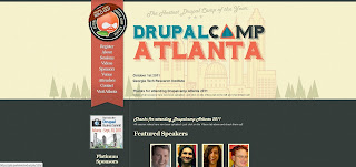
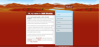
Here are some inspirations for a website design. I like websites that are simple and useful--unless you're specifically an artist who wants to show of your designing/programming/illustration skills or projects, I don't usually like complicated websites.
I liked the following designed because they impliment what I think an excellent website should be: clean, simple, and attractive. I also chose websites that featured illustrations, which is something I'd like to include in my website design.
This one is my favorite--a website for DrupalCamp Atlanta, a conference for people associated with Drupal, a content management system (think website design). I like the subtle details of the 'stitched' style and bookmark navigation bar, the illustrated typeface, and how the front page features a larger illustration that has a treeline motif repeated on the inside pages.
The next example is for a software called Iceberg and has an even more simplified page with a single illustration for emphasis.
The final design is a personal website for an artist Adit Shukla. I think the red color is pretty extreme and could be less saturated for a warm, inviting feeling without as much shock value. But, the header illustration and how it leads into the navigation bar is very creative.
Tuesday, January 3, 2012
Illustrated novel, part 5
This is part 4 of a series of illustrations that I developed for the book A Wrinkle in Time, by Madeleine L'Engle. This is a full page, full-color illustration of the planet Uriel, the first planet to which the children tesseract. Uriel is the mountainous home of beautiful centaur-like creatures with wings.
Subscribe to:
Comments (Atom)


